Part 1 of this series, Paper Prototyping, extolled the fun and expediency of a hand drawn prototype in gathering feedback on your web project.
Part 2 of this series is kind of like the “Is It Cake?” of rapid prototyping. When is a prototype not a prototype? When it’s made with presentation software instead of actual code. My personal favorite is PowerPoint (pausing for gasps, cringes, and head shaking). Don’t worry, any flavor of presentation software will do, but at the end of this post I’ll reveal why I prefer PowerPoint above all others, and it may change your mind…depending on the type of project you’re working on.
Happy Paths Only, Please
To reiterate, the core strengths of rapid prototyping are the speed with which it can be created, and that it exists early in the project lifecycle–its sole aim is to be user tested to create validation of broad layout and design concepts.
The use of slide presentation software for this task – what I’m calling faux prototyping – excels in the speed arena, but because it relies on a purely linear progression through a series of slides meant to mimic an interface, it doesn’t have the capacity for even basic logic or conditionality. Hence, I think of it as a Happy Path tester. Use it to test a specific task flow, knowing that if a user falls off the path at any point, this type of prototype will break down.
While that is a big caveat, this approach still has its appeal, and I’ve used it extensively over the course of my career. To a user experience practitioner, there is a large, conceptually rich space between the content behind the page and the look-and-feel of the finished interface. A faux prototype can be a quick walkthrough test of a single given task or flow.
As a specific example, I was working on integrating a new notification system into my client’s website. Where should the notification icon sit in the header, exactly? How would the notification cards be organized within the slide-out panel? Would there be active links / content within an individual notification card? What would the jump from panel to content look like?
Based on basic web conventions and my familiarity with the client website, I had a pretty good sense of what the answer looked like for each of those questions. Using screen grabs from the client website and layering in the new visual elements via Photoshop, I was able to create a quick slide deck of what that task flow could look like.
Putting it in front of users, it functioned as a basic usability test (since it mimicked click-through events) as well as a prompt for feedback when the prototype did not match the user’s expectations or needs.
Even though it breaks the click-through illusion, it is possible to do some A/B style options with this method, as well. I had two versions of the card organization within the slide-out panel, and by placing them one after the other, the user could toggle quickly between the two using the arrow keys and arrive at a preference, which I noted.
In a best case scenario, you could make up a slide deck on Monday morning, and be gathering feedback and validation by afternoon. Getting good feedback to suggest changes? Rinse and repeat: make edits to the deck and retest. Iterate as needed.
So, a quick recap of what faux prototyping brings to the table:
Super fast
I used screenshots in the example above, but wireframes drawn directly in the presentation software work well, too. The level of fidelity is entirely up to you.
Can mimic click-through
While it’s not truly interactive, it fakes it pretty convincingly as the user clicks to advance the slide deck.
Tight focus
Good for single flows, new page elements in otherwise established layouts, new tasks, or UI refinements.
No code
No need to bust out the code editor, just your visual design tool of choice. Heck, you can even use the shape tools in the presentation software itself if all you need are wireframes.
Finally, I promised at the outset that I would reveal why PowerPoint is my go-to faux prototyping tool, and I can sum it up in one word: animation. I love the animation controls PowerPoint offers! We’re all familiar with the handful of (pretty cheesy) transition effects available in most slide-deck software. In order to simulate a web interface, I usually turn all of those transitional effects off. However, because PowerPoint lets you control multiple facets of any given element on a slide, including transparency, scale, and position, it is possible to create some sophisticated effects which mirror the experience of a full-blown app.
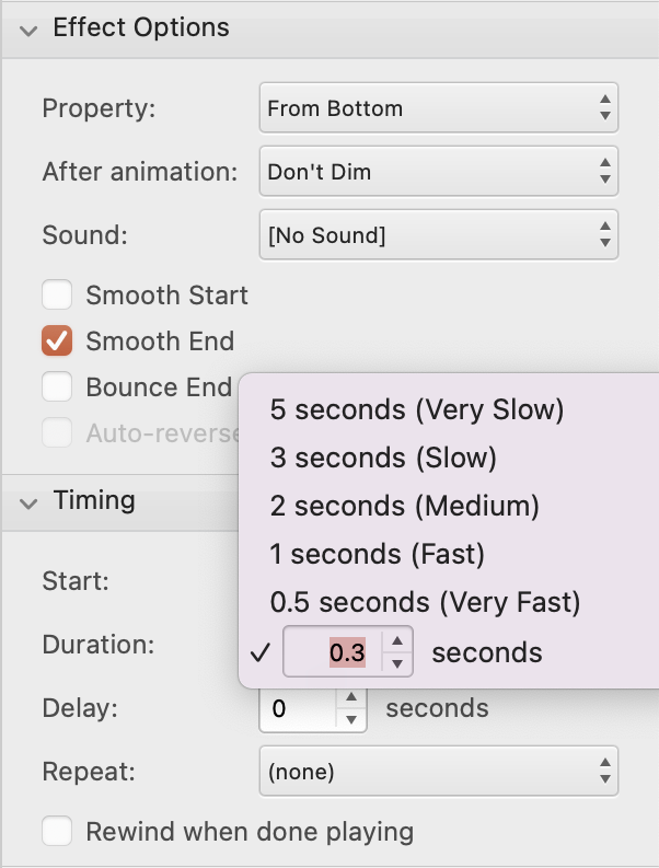
If I’m trying to explore a more experiential task flow, then being able to have elements slide in or out, fade, or change scale can be a huge bonus to comprehension and ease of use. But these are more nuanced considerations, so it depends on the appropriateness of these types of effects to the task or flow being considered.
And there you have it, the “just say faux” approach to rapid prototyping: no muss, no fuss, no code. As mentioned in Part 1, we are moving through these options based on ease and capability; next up in Part 3 the case for good old HTML + CSS.